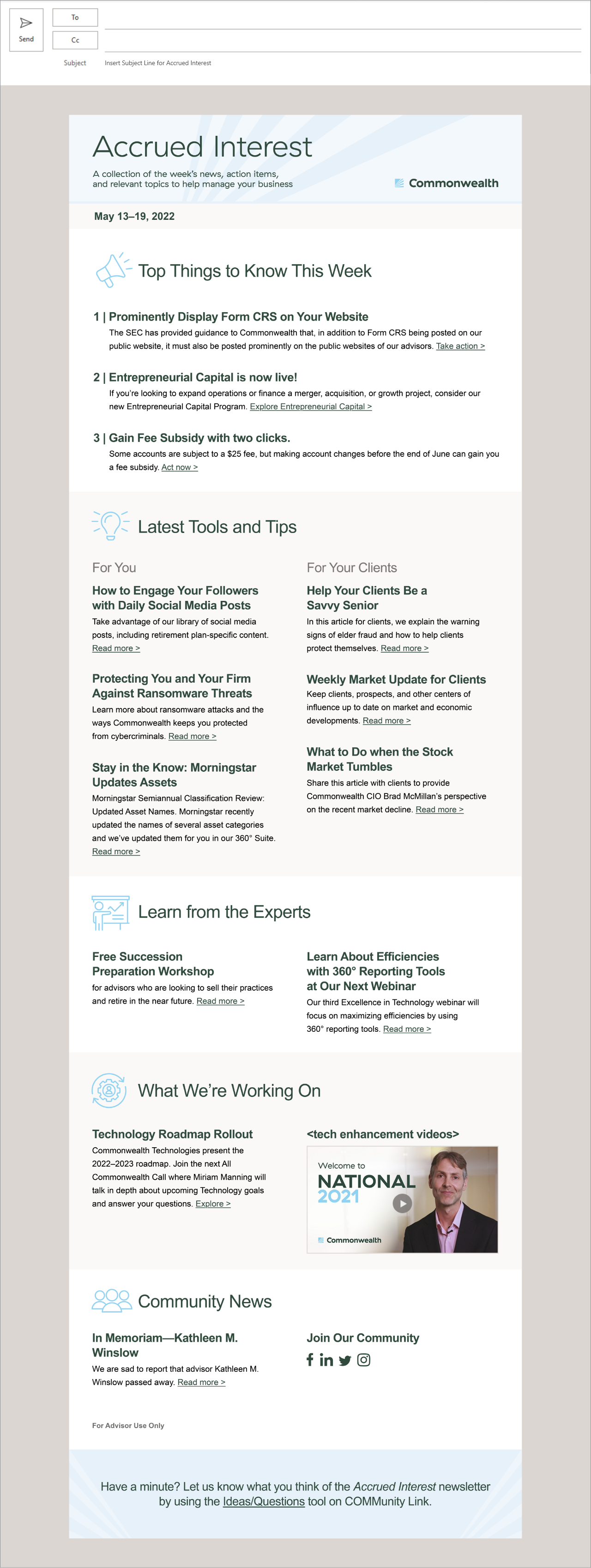
The Accrued Interest was the firm’s redesigned weekly email newsletter for the existing financial advisor base.
Section titles were renamed to help clarify content hierarchy for advisors seeking important or relevant articles. Formatting styles, color palette, and other elements were revised to create visual interest and make newsletter more digestible.
Since the first week of release, the firm received an overwhelming amount of engaging, positive feedback from advisors. They were able to quickly scan for crucial information and other highlights, which led to an increase in advisor engagement and awareness of company news and regulatory updates.
Context:
When Commonwealth first rebranded, the weekly advisor email newsletter was initially designed as a minimum viable product. According to the stakeholders’ feedback, the first reiteration did not generate great interest and engagement from advisors. The section categories and article titles seemed obscure or not intuitive. It also lacked visual interest and felt heavy with the forest/dark green palette.
Process:
In collaboration with External Communications in Marketing, we re-evaluated the organization of content and writing style standards to make it more accessible and digestible for advisors. I crafted multiple reiterations of the newsletter template that also met optimal digital design and accessibility standards. Design had to be feasible enough to be built within the limited design capabilities of Microsoft Outlook.
The revamped newsletter was reintroduced as the “Accrued Interest.” It incorporated a lighter color scheme and a well-defined hierarchy of content. Spaces were built in for images and visuals that would accompany a few articles. Section titles, headlines, and associated blurbs became more succinct and straightforward.
Hide context
